

First off, I should apologize because this post is long overdue. I have been sharing raw measured frequency graphs without ever explaining them. So I finally want to catch up and help with the basics and understanding how to read raw frequency graphs. Very important for anyone to know is that a sound pressure curve alone never catches the full information and is not the definitive measurement for quality! It does help greatly, but I will explain some limitations later.
Quick Navigation
Basics
Frequency on a Logarithmic Scale
You might wonder why these curves are usually presented on a logarithmic scale opposed to a linearly scaled x-axis. That’s just how we perceive the frequencies. I have created an illustration that includes a keyboard to explain it better than with any words I’d type.
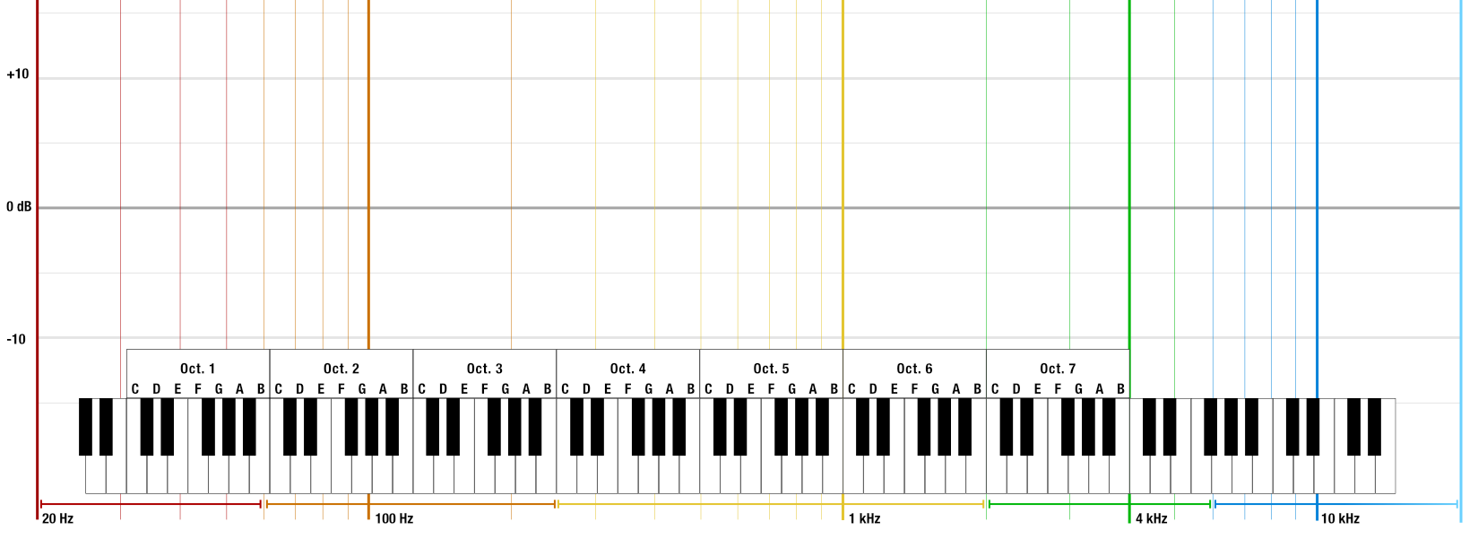
You can see that I have also color-coded different frequency ranges. For example, if I talk about sub-bass, I mean the frequencies below 60 Hz (red). With this information, we can start getting somewhat useful data out of the graphs. But of course, there is one more important aspect to consider…
Perceived Linearity
A measured straight line is not perceived as linear! (At least not how most people measure their IEMs, including me.) If you build a perfect loudspeaker and want to measure it, you put it in an anechoic chamber to eliminate all negative influences, e.g. the room. Then you’d probably measure a perfectly straight line (assuming the microphone is also perfectly linear). But we live in houses that have at least a floor, 4 walls and a roof. The room greatly influences resonances. Even a well-treated room, set up with strategically placed absorbers and diffusers cannot fully negate unwanted amplification – especially of long waves (deep tones). Keep in mind: every instrument will sound different in every unique venue.
Ear Anatomy
Let’s assume we are listening to the perfect speaker in a perfect room. There would still be a huge difference between measuring the sound pressure in front of our face and measuring what our ear drum receives. When measuring IEMs, we try to capture the information that reaches our ear drum. Our outer ear is shaped to help our species communicate and avoid danger. Evolution has shaped our ears to help us find our lost children screaming for help or to hear a saber-tooth tiger stepping on a branch behind our back. Finally, also our shoulders and our crooked ear canals change the frequencies received at the ear drum.
There Is No Single Best Target Response
When Science Fails
So what does perfect linearity look like? I will spare you years of studying audio engineering: There is no perfect target response. For one, we all have a unique HRTF (head-related transfer function), e.g. the effects described in the previous paragraph. Fortunately, there is a ton of useful research data that helps us to create averages. However, studies show that when playing music, these are not received as sounding like we’d expect.
Join the Audio Engineering Society if you want to learn more.
http://www.aes.org/
Manipulating the Audio Information
The biggest „issues“ are the sound engineers, mixers and producers, releasing music that is not meant to be captured perfectly, but most importantly „good sounding“, which is a very vague goal and a huge variable that we – as end users – cannot control. Especially mainstream music is meant to foremost sound good on smart wireless home speakers, car radios, TV soundbars or busy establishments (bars, clubs). That is a completely different approach to what „hi-fi“ means in a scientific sense. But even with all elitism considered, a full dynamic recording is factually not as enjoyable to listen to as when compression has been applied to the same information: they key is not to overdo it.
Read my article on HD audio to find out what high quality audio looks like.
Disappointment, or the Sketch of a Target Response
Long story short, we have different understandings on how the perfect IEM target should look like. The chain of variables and different interpretations cannot lead to the single one target response. But of course I cannot write at length to eventually keep you hanging. At the very least, I owe you a brief sketch of what I believe sounds very natural and fairly linear when output from an IEM.
Here is the key data for the plot:
- a mild bass compensation of 5 dB in the sub-bass
- levelling 700 Hz, 1 kHz and 10 kHz
- 10 dB pinnae gain at 2,75 kHz
- hint of an ear canal resonance at ~8 kHz
It is not meant as a clear reference but much more as a help to read the raw frequency response. I hope that you will quickly find your own preference based on this sketch.
Compensated Measurements
From this starting point, let’s look at some compensated graphs to see if generally accepted subjective perception is in line with the visual plot.
InEar ProPhile 8

Picking up from this week’s special feature, the ProPhile 8 deviates only slightly from the target. For one, the PP8L has slightly less bass. Personally, I agree with InEar’s bass quantity for monitoring. However, my target is meant to better suit general preference in regards to real-life experience opposed to a studio environment. Furthermore, the PP8 have a minor emphasis on the 8-10 kHz area which is partly because of the ear canal resonance and also because my target is meant to cautiously avoid sibilance. As I described in my assessment of the PP8, just 2 dB more in the treble caused them to be too hot and cause fatigue for me too.
Campfire Andromeda
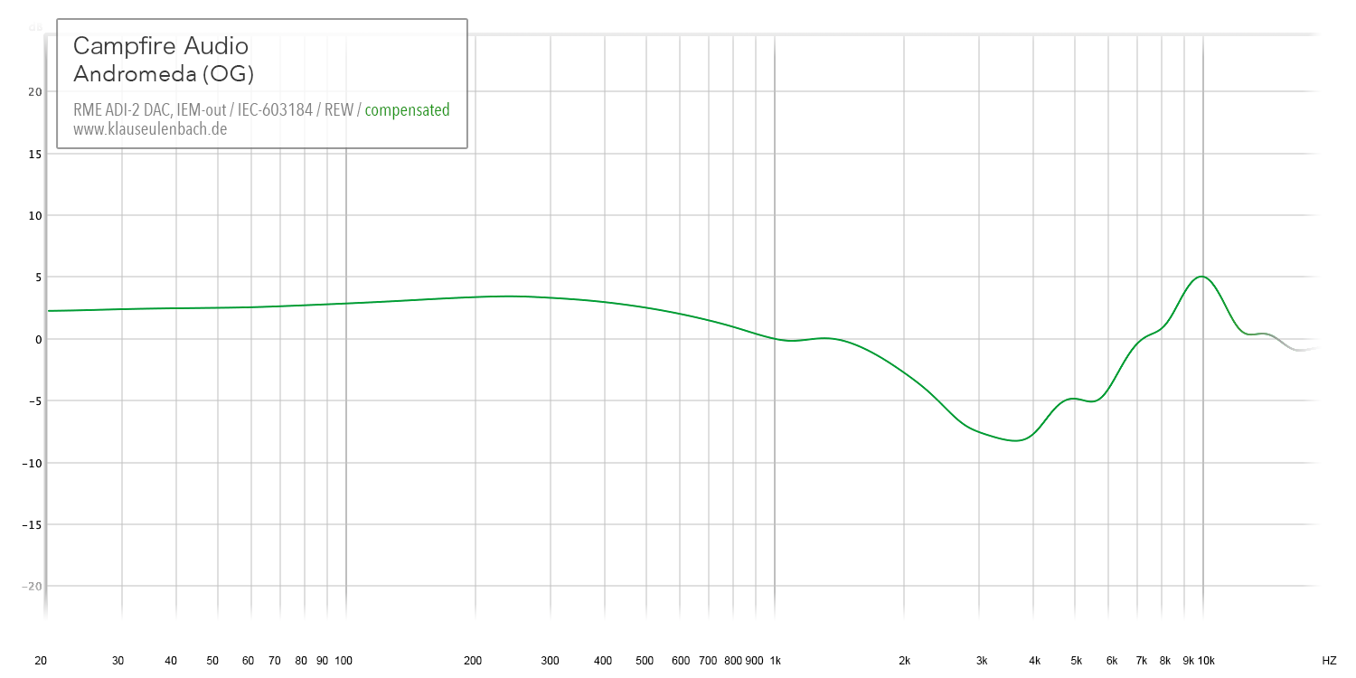
The Andro absolutely deserve praise and recognition. However, far too many reviewers falsely described them as neutral. When I objected and defended my case that I perceive the original Andromeda as warm with a pronounced upper bass and a dull midrange, I triggered a very intense discussion that got me banned from SBAF for “not being a good fit”. True story.
The Andromeda do lose warmth and gain midrange presence with added impedance (balanced amplification, higher resistance cable or better-suited amp). This probably distorted the valuation of some. Head on over to Headflux for more information.
AZLA Horizon

These IEMs feature a very Harman-esque tonality. AZLA boosted both ends of the frequency response and even overshot it in the treble on top. Disregarding that the Horizon are actually a Korean product, you will find that many Chi-Fi brands follow the Harman target and actually push 3-4 kHz much harder than the Horizon. I have featured the AZLA Horizon more in-depth for fans of v-shaped tonalities.
NF Audio NA1
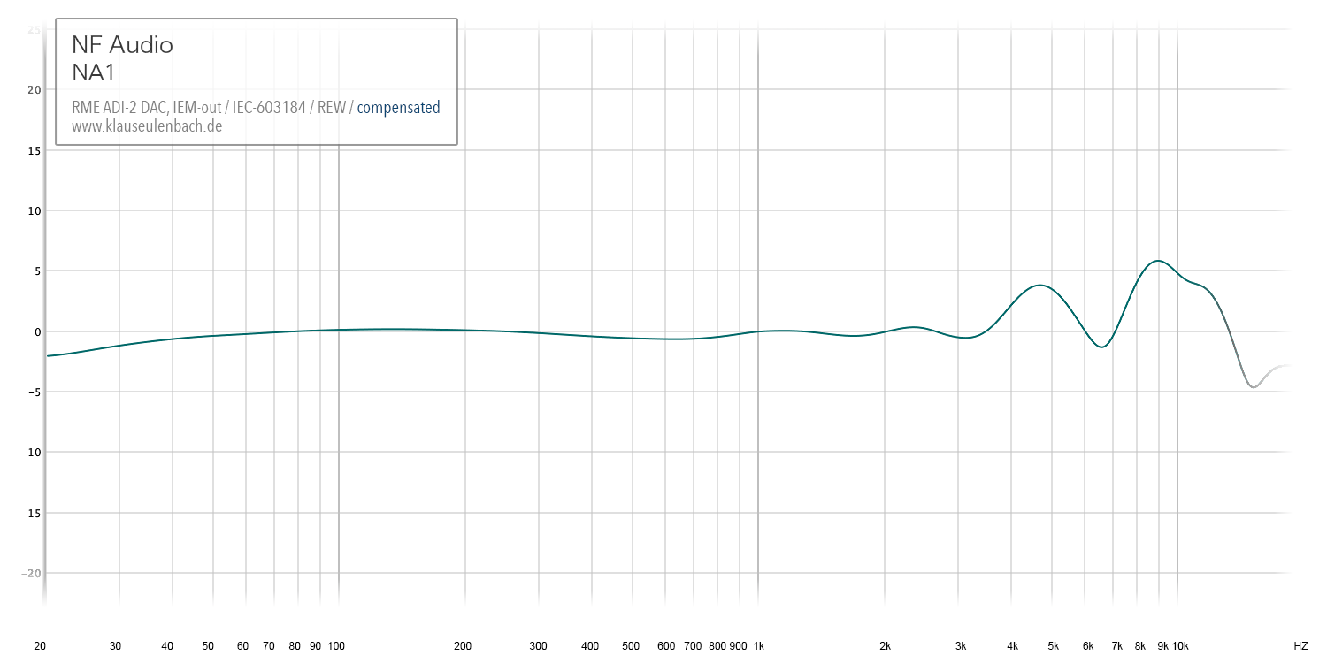
I still owe these IEMs another article, following my introduction, which I will release soon. The budget/mid-tier IEMs are amazing for their price, especially since the single dynamic driver is incredibly fast. However, I will eventually criticize that 4-5 kHz peak which I already isolated as a negative that creates a somewhat hollow timbre. Together with the top-end boost, perhaps an ode to Beyerdynamic’s characteristic definition peak, the tuning can occasionally be fatiguing.
64 Audio A18t
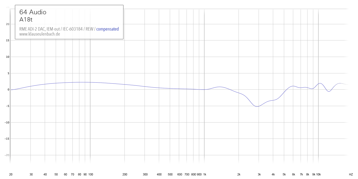
Now on to my current reference monitor. The A18 continue to impress me. The compensated graph shows why. Apart from some added mid-bass punch, there is merely a 5dB cut at 3 kHz that keeps them from hitting the target perfectly. 64 Audio softened the upper midrange to avoid fatigue at high listening volumes. Fortunately, low distortion of 8 drivers for bass and 8 for mids, make sure that the information is free from smear and perfectly detailed even when recessed.
Equalizing to Target
REW can be very helpful to find the perfect EQ settings. Simply divide the raw measurement by the target response and set the filters accordingly. I equalized my A18t to the target and want to share my settings. Of course they are compatible with the new RME ADI-2 DAC FS (all peak filters in this case).
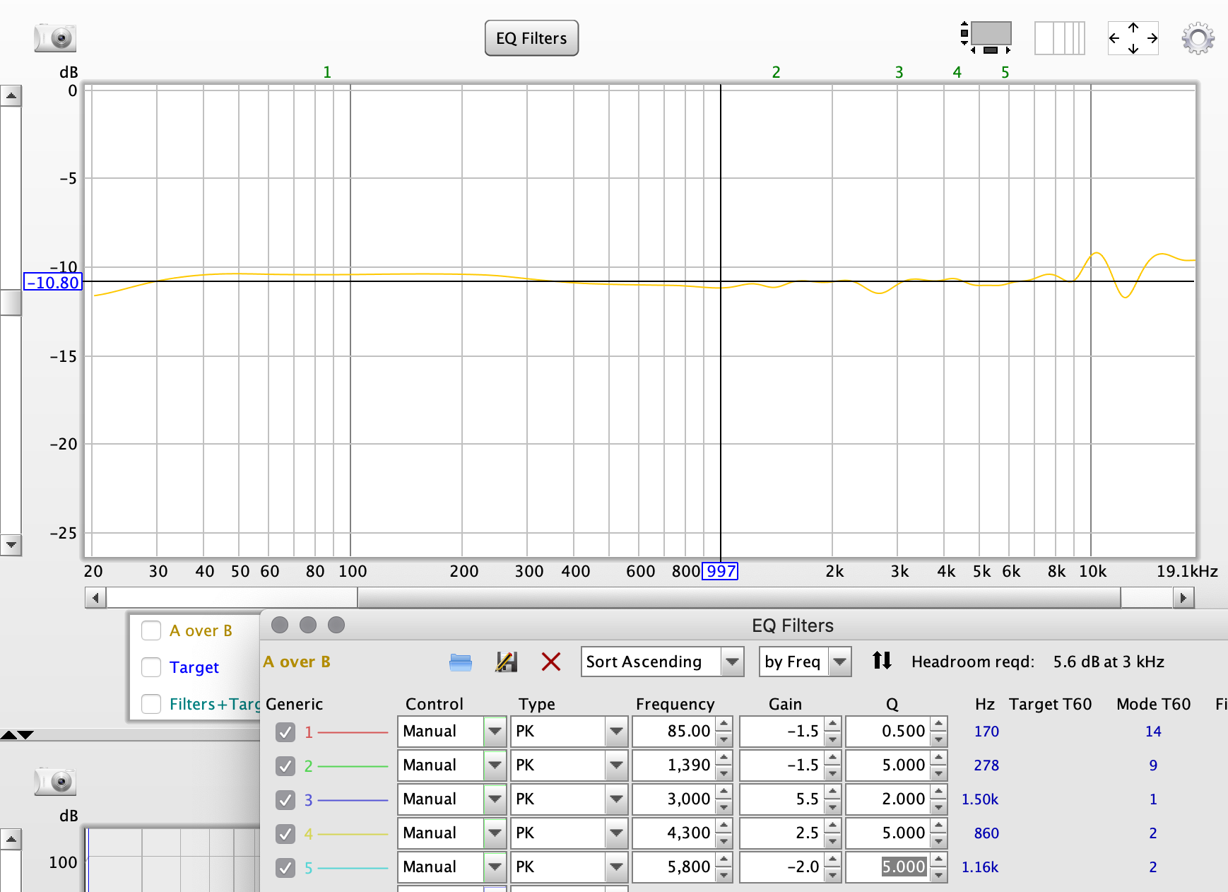
There might be variances among different customs, but I can only say how amazing this sounds with my pair. Toggling the EQ on, the midrange sounds airier and the bass even snappier. It’s not a day or night difference, but this does add the final touch for perfect transparency. End. Game.
Visit the official website to download the latest update of Room EQ Wizard (REW).
www.roomeqwizard.com
Missing Information
As announced in the introduction paragraph, I want to point out some limitations of the frequency graphs. They only help to look at one quality of an IEM. Furthermore, the SPL curve can capture negative influences that distort the information.
Reverberations
Let’s take an example: If you put a driver in a mediocre chassis, or even place a good loudspeaker in a bad room, you will create reverberations. Frequencies can be reflected, which will then amplitude the pressure. (It’s actually a bit more complex than that.) What you hear then is not a single tone but actually a string of a multitude of the same tone. A blur. Of course you can measure this effect too, but it is not shown in the frequency response. It will simply appear as a stronger amplitude.
Distortion
I have a second example: Every audio chain – and especially the driver – creates distortion, which is defined as the effect of harmonics of the sine being played. If you sweep 1 kHz, you will automatically create sounds at multiples of that tone, e.g. 2, 3, 4, 5 kHz, etc., effectively masking useful information. We are usually talking about very low distortion, but the effect can become very apparent if you imagine that every frequency played is adding noise. That is an infinite amount, mind you. A frequency response graph shows the sound pressure output (y-axis) of a single tone (x-axis), not telling you how distorted that specific note is. (You need very expensive equipment to accurately measure THD.)
… and more
Then, of course, you have further sonic qualities like transient response, decay, crosstalk and more. Add these to obvious qualities like isolation, comfort and build quality to get a more broader sense of how important the frequency response alone is when trying to judge the quality of an IEM. Let alone that every piece of the audio chain adds their own effects, including DACs and amps. Nonetheless, the SPL curve helps immensely to explain what we hear.
Closing Words
FYI, I do not plan to upload the compensated graphs in the corresponding section. I try to match the raw SPL curves to my hearing and some resonances might shift depending on the best possible fit – yet the target is fixed at 8 kHz. Also, my sketch of a response curve is partly based on subjective experience and is not an academically accepted target. My compensated graphs are to no use for people who do not agree with my assessment.
Finally, there is much more I would like to cover, like the variance of the ear canal resonance and how you can deliberately change the tuning by placement of the IEM, or changing the target to display characteristic tunings that are often perceived as an improvement. Sadly, I must save this for a different time. Nonetheless, I hope this was helpful to make some use of my measurements.
say thanks to so a lot for your internet site it aids a whole lot.
Thank you. It helps.
By the way, I want to know which IEM is perceived as linear to you.
Can you rank all IEMs?
Thank you again.
Hi Jihwan,
thank you for your message. I am actually working on a product rating overview list, but I’m only at 30 IEM so far, so I will increase the number before I release it.
I won’t give single ratings, though, so it will depend on the demands. I have set up a spreadsheet that gives a different rating according to music genre and category (product design).
However, the InEar ProPhile 8 and the 64 Audio A18t will be very high up in general. Best value goes to the Kanas Pro.